Back to Portfolio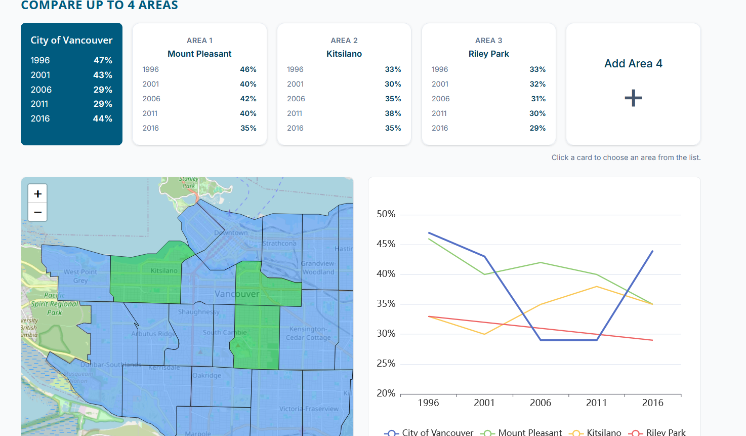
Project
Affordability Dashboard
A data-focused dashboard experience that helps users explore affordability trends through interactive charts, mapped data, and clear visual structure.
Role
Front-End Developer & Data Visualization Designer
Year
2025
ReactEChartsTailwind CSSLeaflet
Overview
The affordability dashboard was designed to make complex location-based data easier to explore and compare. The interface combines charts, geographic context, and interactive filtering to help users understand trends without feeling buried in information.
Key features
- Interactive charts powered by ECharts for clearer data storytelling
- Map integration with Leaflet to provide geographic context
- Responsive dashboard layout built for usability across devices
- Modular data views that support faster scanning and comparison